
activityhero · 2020–2022
I led product design for a two-sided marketplace where the design decisions had to serve parents, children, providers, and growth — all at once.
$20+M
Attributed revenue from the redesigned surfaces in 2020
10K
Businesses & teachers
4M
Families shopping the marketplace
50K
online sessions listed
1 — THE CHALLENGE
A marketplace where the customer and the supplier need opposite things.
ActivityHero connects parents looking for kids' activities with providers running camps, classes, and lessons.
The design challenge was focused on strategy. Where do the two sides genuinely benefit from the same decision, and where do they require us to choose? And how do we make the trade-offs deliberate rather than accidental?
2 — THE APPROACH
Design that treats trade-offs as the work, not the friction.
I built a working method that made the trade-offs explicit. Parents want browsing speed, transparent pricing, and trust signals. Providers want listing depth, lead quality, and conversion at booking. Build for one side and the other side erodes.
"Kathrine Olson is a star performer. She is smart, dedicated, quick, focused and has attention to details. She would be a great asset to any team she joins! I would hire her again in a heartbeat!"
— Shilpa Dalmia · CTO · ActivityHero
3 — THE WORK
Two design decisions, one operating principle.
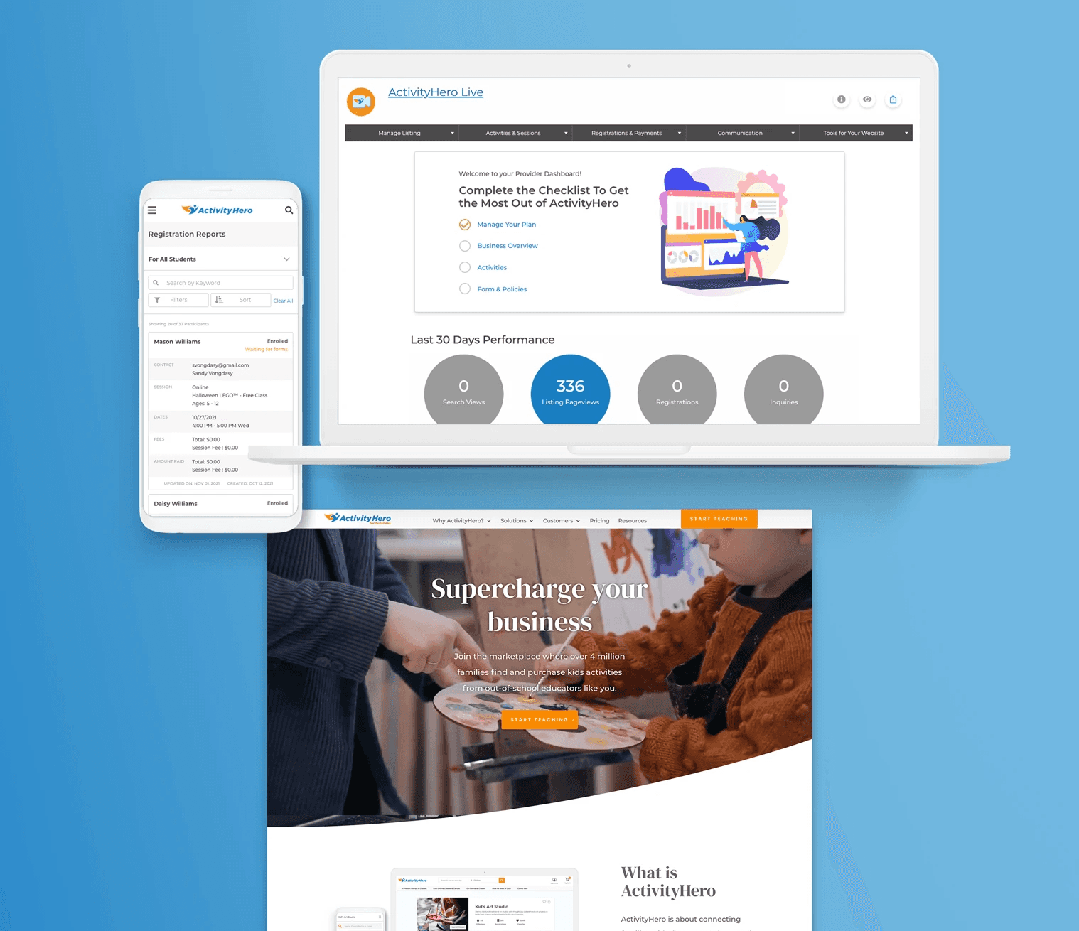
Provider side: compressing 12 steps into 4, then catching what the compression broke.
I compressed onboarding from 12 to 4 steps and lifted conversion by 7 percentage points. But the more interesting work was what surfaced as I designed it: the depth-building couldn't disappear, it had to move.
The onboarding wizard was the second-order answer — a guided tour that met providers at their first dashboard visit, walking them through the credibility-building tasks, where it actually mattered.
This is the part I'm most proud of: recognizing that compression was creating a new problem in real time and staying with it long enough to solve both.
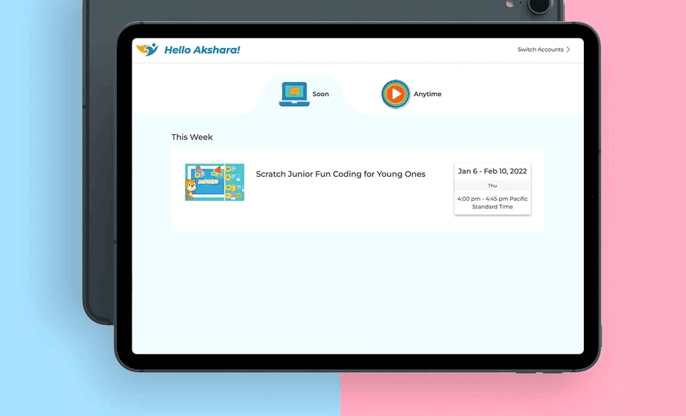
Customer side: designing for the user who isn't paying — and finding that's what makes the buyer come back.
The customer side of the marketplace has two users in one household. Parents pay; kids attend. The thesis I held was that retention on a kids' activities marketplace depends on the kid's experience, not the parent's purchase.
I shipped child profile management — independent access for kids — and, for the youngest users, a countdown timer that told them when to sign in to their online class without needing a parent. The countdown timer is the detail I think about most. It's a tiny piece of UI doing strategic work: it makes a six-year-old self-sufficient at the exact moment online learning is hardest. Parents notice. Providers notice. The marketplace gets stickier for both.
In 2020, this work supported 50,000 online session listings. The parents who came back were the ones whose kids could do it themselves.
3 — WHAT THIS WORK TAUGHT ME
Two-sided marketplace design is strategy disguised as UX.
ActivityHero taught me that the most important design decisions in a marketplace aren't on the screens — they're in the policies, the surfacing logic, and the trade-offs you make.
Product designers who try to optimize a marketplace one side at a time tend to ship local wins that hurt the system.
The job of senior design in this context is to keep the team holding both sides at once, even when it's harder.